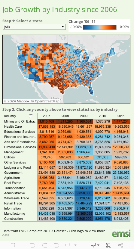
Deep orange indicates very strong job growth, deep blue indicates large losses. Texas in particular stands out strongly.
The chart also shows job growth by industry. Notice the strength of mining/extraction, healthcare, and educational services.
This interactive map may take a while to load. Please give it extra time.
The interactive map is via Tableau Software with data from EMSI, Economic Modeling Specialists. Specific thanks to Ross Perez and Ellie Fields at Tableau Software.
Mike "Mish" Shedlock
http://globaleconomicanalysis.blogspot.com
Click Here To Scroll Thru My Recent Post List