Equity futures are neutral and hanging onto the bottom of the symmetrical triangle with the dollar down slightly, bonds down, oil flat, gold & silver down, and food commodities close to breaking below their ranges. As you can see in the S&P 500 futures chart (/ES) below, prices struck the bottom of the symmetrical triangle and then bounced. This is the game that just is as computers now drive the action:

Housing Starts fell in October, but came in slightly higher than consensus, while permits rose somewhat. Here’s Econosellyouanythingsucker:
Highlights
New residential construction essentially held steady in October but homebuilders may be increasingly optimistic as housing permits jumped. Housing starts in October nudged back only 0.3 percent, after rebounding a sharp 7.7 percent the prior month. The October annualized pace of 0.628 million units beat analysts' estimate for 0.605 million units and is up 16.5 percent on a year-ago basis. The dip in October was led by an 8.3 percent decline in the multifamily component, following a 35.0 percent spike in September. The single-family component rebounded 3.9 percent after a 2.6 percent decrease the month before.
By region, the decrease in starts was due to a 16.5 percent drop in the West. Other regions gained with the Northeast up 17.2 percent; the Midwest up 9.7 percent; and the South up 1.6 percent.
It is not gangbusters but it certainly is an improvement for future construction as housing permits jumped 10.9 percent after declining 5.8 percent in September. But the optimism is mainly for multifamily construction. The October rate of 0.653 million units annualized posted notably higher than the consensus forecast for 0.605 million. Permits in October are up 17.7 percent on a year-ago basis.
For the latest month, multifamily permits gained 24.4 percent while single-family permits rose 5.1 percent. On a year-ago basis, multifamily permits are up 48.0 percent while single-family permits are up 6.6 percent. Homebuilders clearly are more optimistic about the multifamily sector than single-family. Apparently, excess supply is still somewhat an issue for the single-family sector, along with continued soft demand.
Building more houses into falling prices simply makes no sense at all. And, gee, let’s put a chart to those numbers to give us a little historical perspective – you can call that “more optimistic” if you like, I call it a depression, as I note that none of the other recessions have produced numbers anywhere near these:
Housing Starts:

And while we’re looking at that obvious disaster chart, let’s point out some basic chart skills – it’s always important to consider the historical perspective. If you do not, then you might look at a chart like the one below, published by Econopretend, and conclude that the market is pretty darn stable:

Of course the housing market is stable, it went splat after falling off a cliff. Always consider the timeframe…
Jobless Claims fell by 2,000 in the prior week, not the 5,000 advertised by Econocomplicit who compares unrevised apples to revised oranges:
Highlights
Jobless claims continued a recent, mild downtrend with a 5,000 decline in the November 12 week to 388,000. Initial claims have decreased three weeks in a row and in four of the last five. The four-week average dipped 4,000 to 396,750.
Continuing claims, in data for the November 5 week, dropped 57,000 to 3.608 million.
The insured unemployment rate was 2.9 percent for the week ending November 5, unchanged from the prior week's unrevised rate.
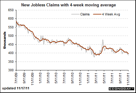
Again, shifting out to put a historical perspective on the Initial Claims number, we know that it requires a number below 350k to indicate job creation. On the chart below showing the historical perspective, I drew a red line at the 350k mark, but keep in mind that line shifts up as the population grows. In the short view of Econoday’s chart, the recent trend is that claims are coming down, but looking a the historical trend we can clearly see that the trend is up:
Initial Claims:

When I overlay the Mean Duration of Unemployment (red graph) against the Initial Claims chart (blue graph), we can see that the trend is for the Mean Duration to begin falling a year or two after the Initial Claims begins falling, and therefore it may very well be that the Mean Duration of Unemployment chart has peaked as well:

Of course this cycle is very different. The unemployed stay unemployed and then fall off the rolls expiring first normal, and then emergency benefits. Our Unemployment figures fail to track these people and don’t count large portions of the population who are out of work.
Moving on to another lesson, I’ve been using the term money(ness) a lot lately to be inclusive of all things that act like money, including actual money which is a very small fraction of total moneyness these days. A good example of moneyness is margin, like many have in their brokerage accounts.
Margin allows you to effectively own and control more (stocks, commodities, whatever) in your account than you have actual money in your account. Say you have $100k, and a 20% margin account, then you can own $120k worth of stock. Now think about this… if everyone who owned stock used 20% margin, then the market would effectively be 20% larger in dollar terms than it otherwise would be. And neither the “Fed” nor any banks had to “print” money to accomplish this. That money(ness), in effect, is created by the brokerage houses, it is a form of leverage (it is also a form of money from nothing creation and therefore should be very regulated by the PEOPLE - again, giving brokerages the ability to make money from nothing is a privilege granted by the people and can be revoked).
Now imagine that you all at once ban margin, what happens to the stock market? What happens when you offer more margin? See why it has such a powerful effect? Indeed, it was margin that helped to create the “Roaring Twenties,” which popped in spectacular and historic fashion in 1929.
Today there is a ton of margin, but there is a massive, gigantic, historic sized pile of money(ness) that we call derivatives. Derivatives do the same thing as margin, they create leverage. The failure of MF Global is a huge red flag, it is very much like the failure of New Century Financial, the first subprime lender to fail. It took the market quite a while before the subprime dominos fell from that point, I’m just saying that I smell a crack in what has become the world’s largest money(ness) bubble.
Go Occupy! Bloomberg go to hell. Please take the time to watch the following video. Think about the courage of this young man – proud of him! That is all, have a nice day!